


The majority (89%) B2B Buyers are doing their online research before they ever contact you. The take here is that your website is your biggest sales tool. It must shine and stand out among your competitors.
Why You Need a Sales-Ready Website by the Stats:
-
According to the Demand Gen Report B2B customers, today progress more than 70% of the way through the decision-making process before ever engaging a sales representative. That means you don’t know the customers you could be losing before the sales process even begins.
- Buyers in all industries are using digital content to make their purchasing decisions, and B2B is no different. An overwhelming majority (89%) of B2B researchers use the internet in their research process and they conduct 12 searches prior to engaging on a specific brand’s site.
The Sales Website Must Haves:
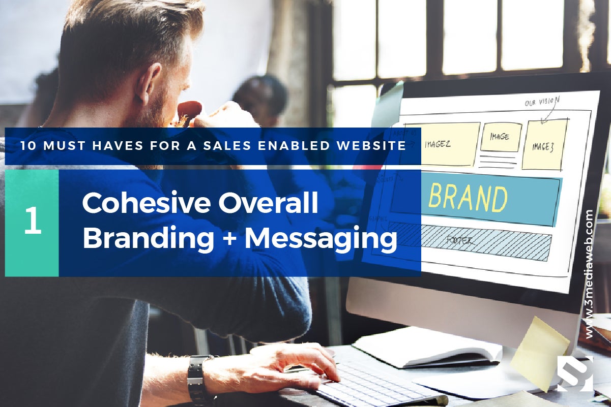
Cohesive Overall Branding + Messaging
Your website needs to represent your brand, loud and clear. As your #1 sales tool, first impression is everything. From your logo to your colors, to the text on your website, your message and visual brand need to be cohesive. From your Facebook Page to your LinkedIn Profile, your company’s image and message should portray the same look, feel, and ideas across the board.
According to Leapgo.com your cohesive brand image involves choosing certain fonts, graphics, illustrations, colors, and tone of voice and then being consistent with these on all of your platforms and marketing materials.
When customers first land on your website, you want them to find what they are looking for and send the right message. There are several ways to make your website more cohesive, and since your website the most important part of your brand, this should be your first sales and marketing priority.
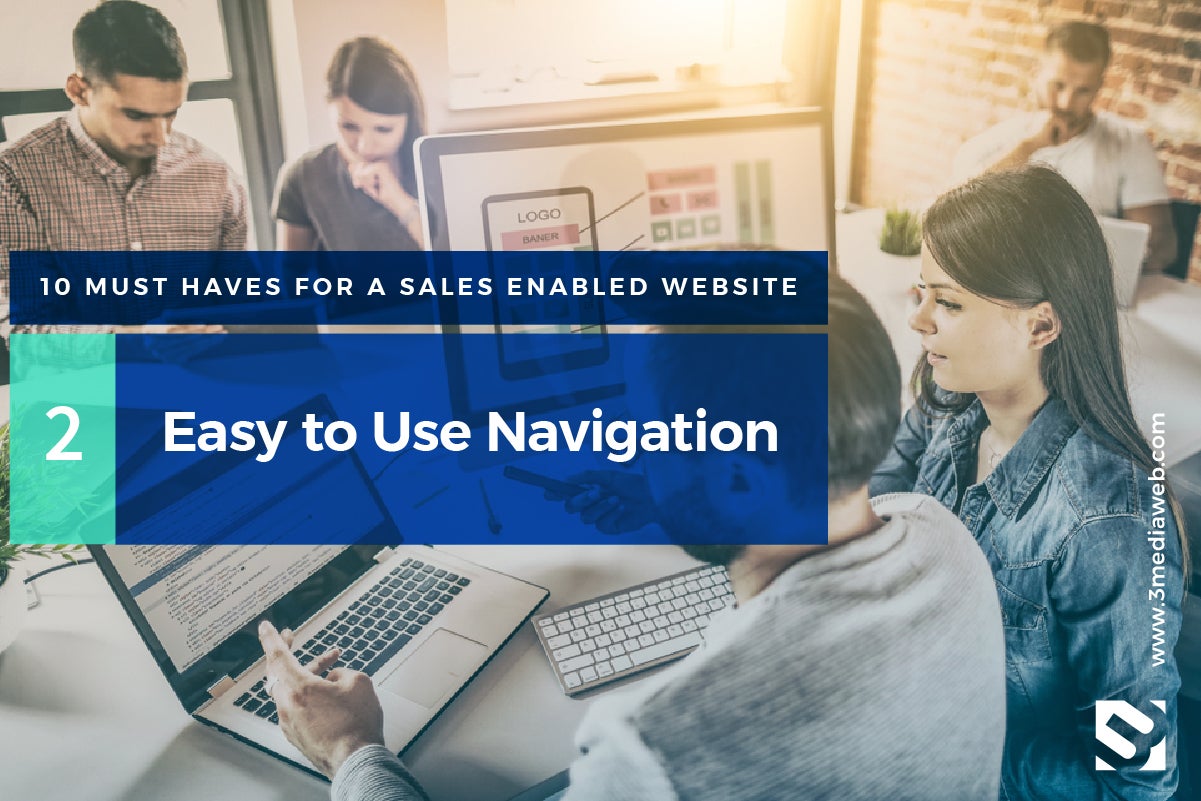
Easy to Use Navigation
Using simple and clear website navigation design, your visitors will easily be able to find your blog, your products or online product store, services, pricing, contact information or help docs.
According to user experience company Crazy Egg you should start with this rule of thumb: the website navigation structure should allow someone to land on any page on your site and find what they need within three clicks.
Information architecture is an important part of web design and part of our five-step proven process. While gathering information and data during the “discovery and design” phase, diagrams are created to organize the necessary navigation and how it will be implemented.
Some recommendations for improving the experience start with streamlining the navigation, keeping sidebars separate, placing navigation in a standard location, put a lot of effort into organizing the website’s footer and leave buttons for call to actions.
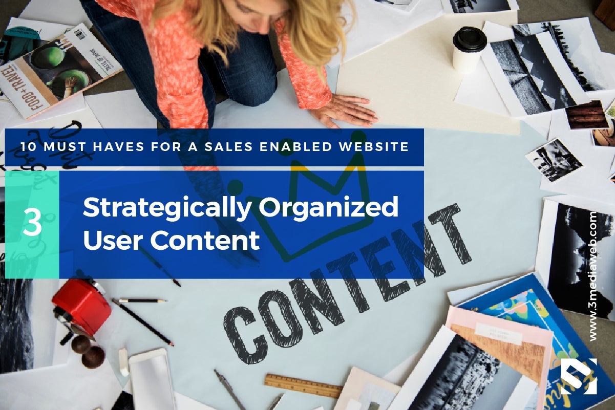
Strategically Organized User-Content
You can use the information architecture created in the “discovery and design” process to start organizing your content. Strategically organized content must be logical and bring the user through the journey you want them to have. Use mock-ups or “wireframes” to strategically place “teaser” content that flows and guides the user to where you want them to continue to go. For example, a blog post talking about a specific product might contain several hyperlinks to other pages about that product, how it’s used or even case studies. The content should continue to flow to the action you want the user to take, a download, contact form, order or email subscription.
Once your website is live, you can use a hot map tool like Crazy Egg to analyze where your visitors are going and using that data to improve your content and optimize the user’s experience.
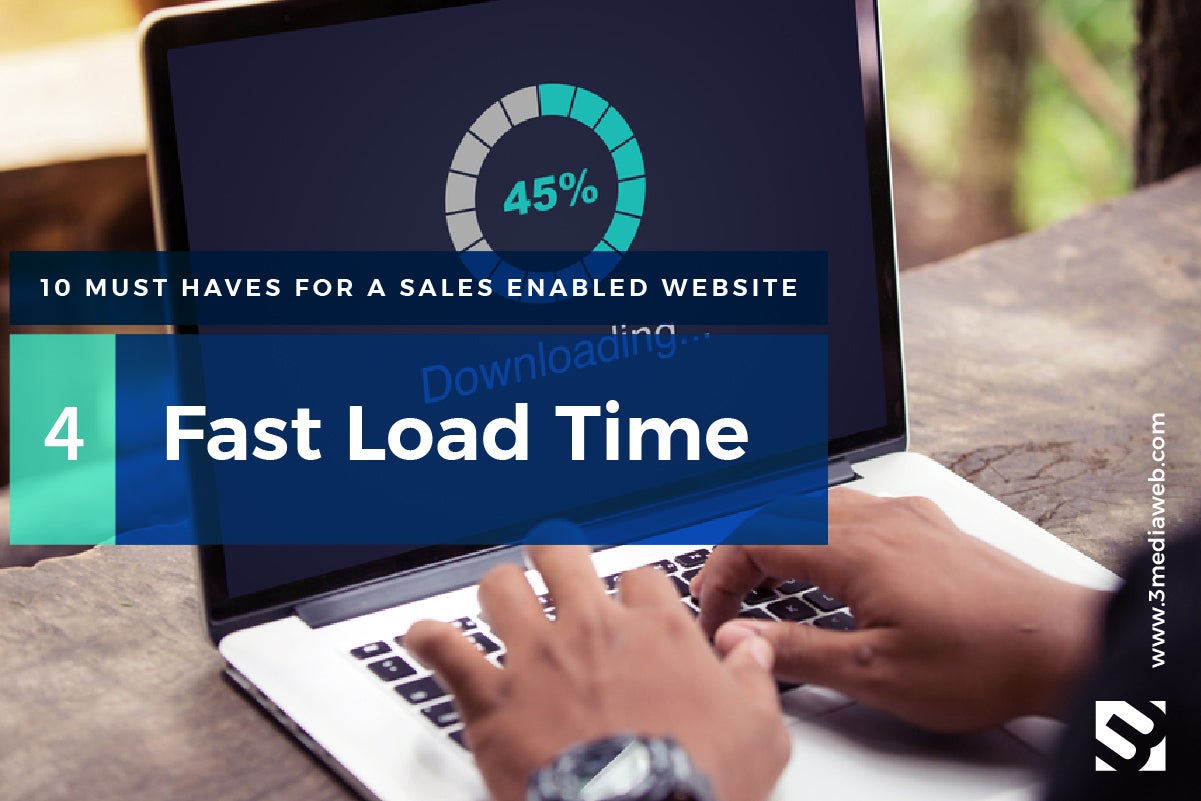
Fast Load Time
How often have you landed on a website (especially on mobile) and sat there waiting for it load? Did you stay or leave? In many cases, your visitor will be gone within a few seconds. Speed is crucial to getting people to your site and continuing to browse and take the user journey you hope for.
Google has indicated that speed (speed of both your site as a whole and individual pages) is one of the factors its algorithm uses to rank pages. Google also takes a careful look at user experience to determine rankings — and a slow experience is a bad one.
So if your website is slow, good luck getting sales or leads, let alone just getting a visitor to even land on it.
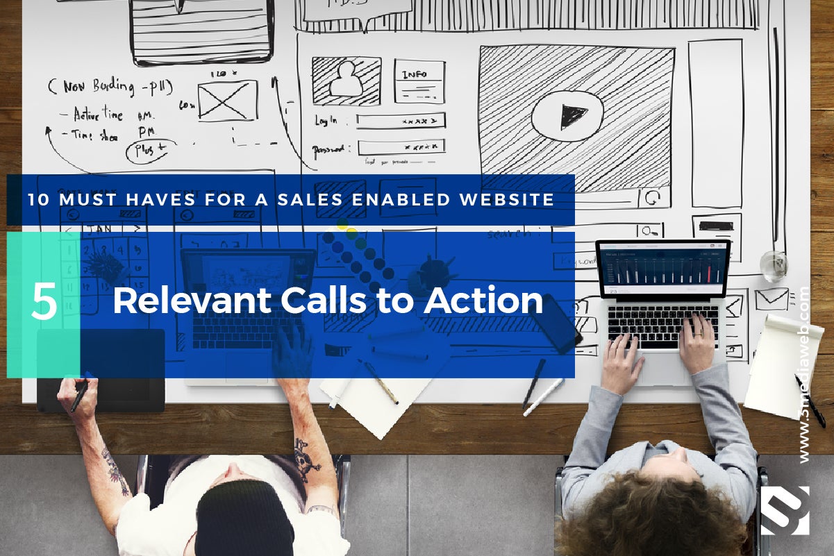
Relevant Calls to Action
A call to action is usually designated by a button or text on your website, calling the user or visitor to take some action. Calls to action usually are written and presented as action verbs, to get the user to take the next step.
According to Balance Small Business: “The most obvious use for a call to action is in sales, such as “Buy Now!” However, the sales process isn’t the only place a call to action can be helpful. If you have a high-priced item or service, in which it can take time to encourage someone to buy, a call to action that acts as a road map toward sales can be helpful. For example, you might say “Call now for a free estimate.”
A call to action can be used to build your email list (“Sign up for a free report now.”), increase your social media following (“Get more tips and coupons by following us on Facebook!”), keep readers on your site (“Click here to read more about…”), and much more.”
The big question now is how do you place those “calls to action” in the best, most relevant places throughout your website. Where the CTA’s live on your website and what they say really depends on your content and how that matches the action you want to take according to the visitor’s stage in the buyer’s journey. Working with a professional web design agency, will provide you with the guidance and consultation you need to get the best ROI on your calls to action.
An Easy-to-Use Content Management System
Being able to easily change content on your website is an essential part of A/B user testing and website improvement. That is, testing to see what copy, call to action placement or messaging works best for improving lead generation.
Testing and improving your website on an ongoing basis will require an easy to use content management system (CMS). Content changes such as page creation, new forms, layout improvements and messaging need to be simple and easy for you or your web agency to manage. This is why you need to choose an easy-to-use content management system for your website. One of the most popular platforms out there is WordPress, but there are various others out there too.
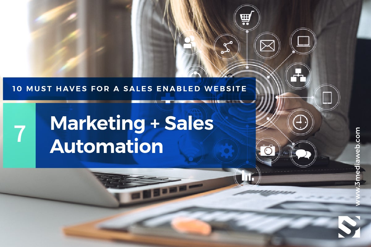
Marketing + Sales Automation
Marketing + sales automation involves software integrated with your website with the goal of executing marketing + sales actions (i.e publishing social media posts, sending out emails, saving contact and lead information) with little or no manual effort.
These tools exist to make marketing and sales more efficient and effective for you. Marketing and sales web integrations allow you to track and automate tasks, save and document information, connect with your buyers, and manage the success of your programs.
With these tools in place, you can more improve your sales and marketing workflow and the success of your programs.
Relevant Targeted Buyer Content
When organizing and putting together content, you need to keep the target audience in mind and make sure the copy is speaking to them. Remember it’s about them, not you.
Ask yourself the following questions about your customer:
- Who is the audience you are building this website for?
- Are you answering their basic questions?
- What are your customers’’ needs?
- What are your customers’ pain points and can you solve them?
- Does your website content easily fulfill the needs of their visit?
- Are you speaking to your audience in a language they can understand (their language.)
- How will you substantiate your claims? E.g., testimonials, social proof, etc.
- Are you guiding your visitors to do something on your site, like take the next step?
- Is there a “call to action?” E.g., sign up for a newsletter, make a purchase, submit a contact form, visit the next page, etc.
Clean, SEO Friendly Coding
71% of buyers start their research with a generic web search. Your website needs to rank at the top of the search engines for terms relevant to what your buyer is looking for.
If buyers can’t find your website or brand during their initial research process, you haven’t even entered the research phase of their buying process. You won’t even know you missed out on an opportunity. Making SEO a priority is crucial to successful lead generation.
- 62% of B2B buyers say that a web search was one of the first three resources they use to learn about a solution.
- 71% of B2B researchers start with a generic search — rather than searching for a particular company.
- B2B researchers do an average of 12 searches before engaging with a specific brand’s site.
- According to an Accenture study, 94% of B2B buyers conduct online research at some point in the buying process.
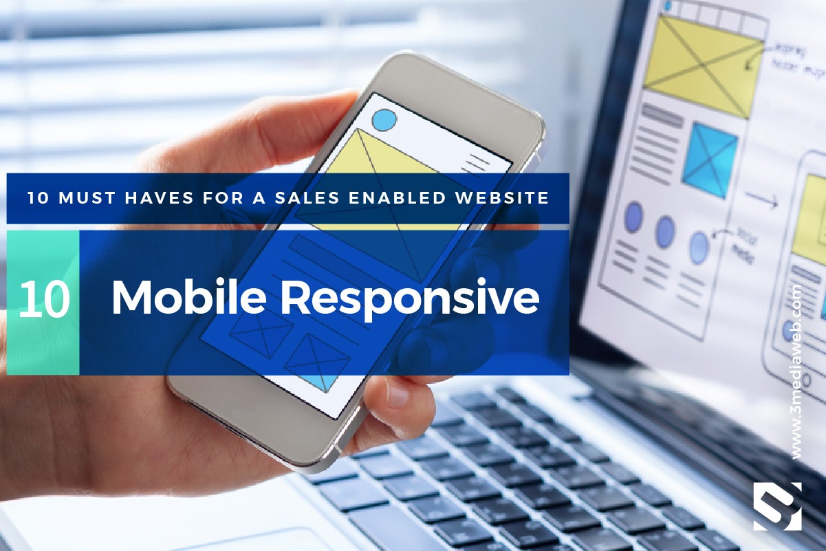
Mobile Responsive
Being mobile responsive means your user having the same experience across the board on your website no matter what device they are on, phone, tablet or computer. Stay ahead of the competition (even 44% of Fortune 500 companies are not mobile-ready at this time!).
Because over 60-percent of searches come from mobile devices, having a mobile-optimized site means opening the doors to more leads who will come to you from smaller devices.
Responsiveness in your design can also affect your Google Ranking or your site’s SEO another reason why it is of top priority. SEO can be one of our main sources of online leads and sales, so review your website’s experience on mobile and improve it, ASAP.
You Website Should Help you Reach your Company’s Goals and Objectives
To improve sales, your site has to be lightning-fast and super easy for users to find crucial, relevant information about products and services along with targeted content such as success stories and case studies. It needs to speak to your buyer.
A website that focuses on usability and architecture is the key to exposing the right content to your target audience. Helping you reach your end business goals and sales objectives.