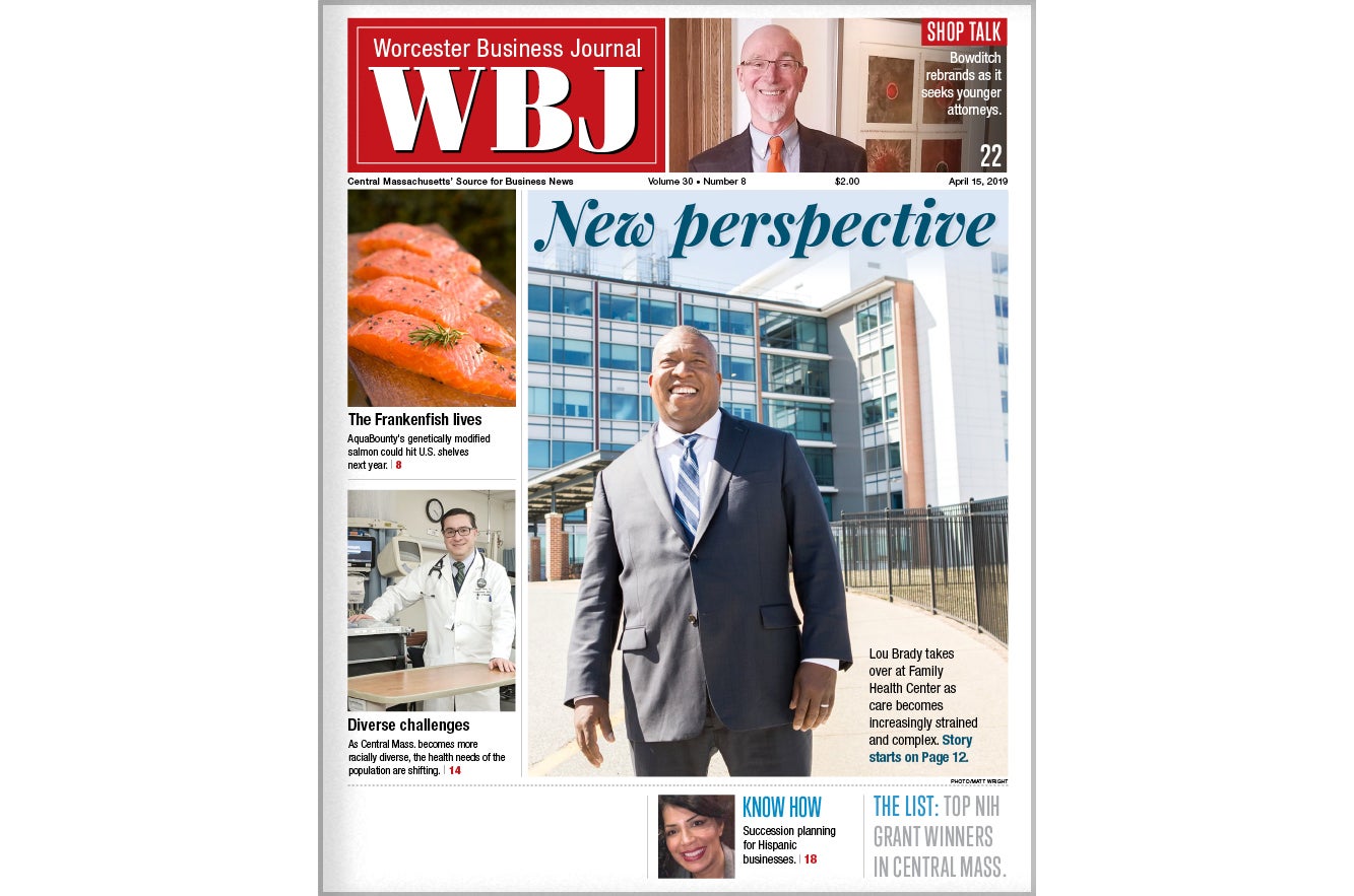
Welcome to the redesigned WBJ
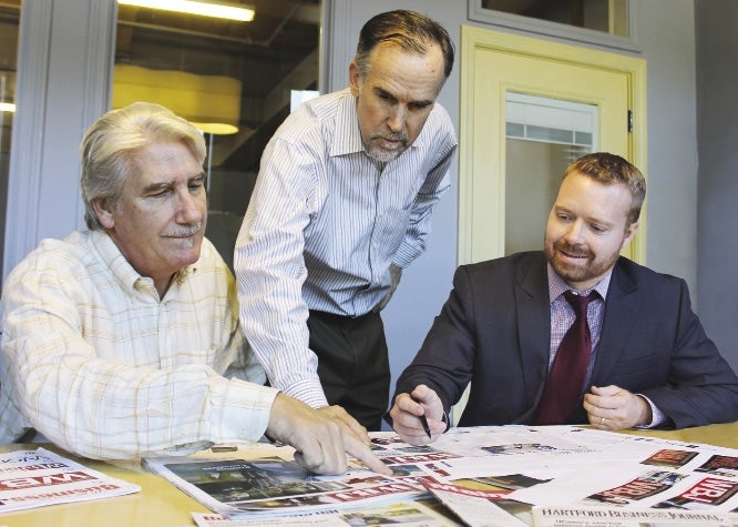
 PHOTO/SAM BONACCI
Publisher Peter Stanton (center) worked with associate art director Mitch Hayes (left) and editor Brad Kane (right) through the 10-month redesign, which included more than 20 different logo looks, nearly 30 feedback sessions with readers and advertisers, and one final session over the length of this column.
Let me start by getting this out on the table – I hate redesigns.
As someone who has been in the publishing business some 35 years, I've always had a keen eye for magazines and newspapers that would periodically introduce a “bold new look.”
What are you doing changing the publication around?
I didn't ask for a new logo, the typeface was not broken, I was used to the columns and sections the way they were – and now you've gone and rearranged the furniture on me – don't you understand us readers don't like change!
After grumbling to myself for a couple issues, I'd invariably forget about my objections and over time grow to appreciate the new elements of the publication.
So with that in mind, welcome to the newly designed Worcester Business Journal.
Many of you are no doubt more open-minded that I am and will like the changes we've made right out of the gate.
However, others will be resistant and will take time to warm up to the new look.
The truth is, most publication teams put in a significant amount of time, thoughtfulness and talent into improving the reader's experience – and our redesign effort is no exception.
Editor Brad Kane has worked tirelessly getting to know our readers, their interests and habits in consuming the WBJ. His partner in crime in this process from the design side has been Associate Art Director Mitch Hayes, who delivered countless prototypes and design templates for our internal team and our readers to review and critique.
The culmination of all of their work is this fresh new look for our 27-year-old publication.
Why did the WBJ undergo a redesign?
There are many reasons. One is the need that all businesses have to push the “refresh” button, to stay sharp and creative in delivering a unique, valuable product to the marketplace.
Another is the evolving nature of how readers consume our news and information products – from print to digital to events.
More and more, news is traveling through our digital channels, including the WBJ Daily Report e-newsletter and our website.
Deeply reported, insightful pieces along with strong photography and a series of explanatory charts and graphic elements are best delivered and consumed on the printed pages of Worcester Business Journal.
While our print readership remains rock solid, the delineation of what runs in print vs. the digital arena is growing clearer. And the new design of our flagship print publication is in response to those trends.
The new logo reflects the fact that a large group of readers have come to know us by our shorthand name – WBJ – as well as our proper full name.
The new cover and interior page designs reflect a forward looking, contemporary blueprint, with a set of templates that will keep the publication fresh and vibrant issue after issue.
We're here to deliver the business news and information leaders need to be successful.
We've got a fancy new bow on our packaging. We hope you like it!


0 Comments